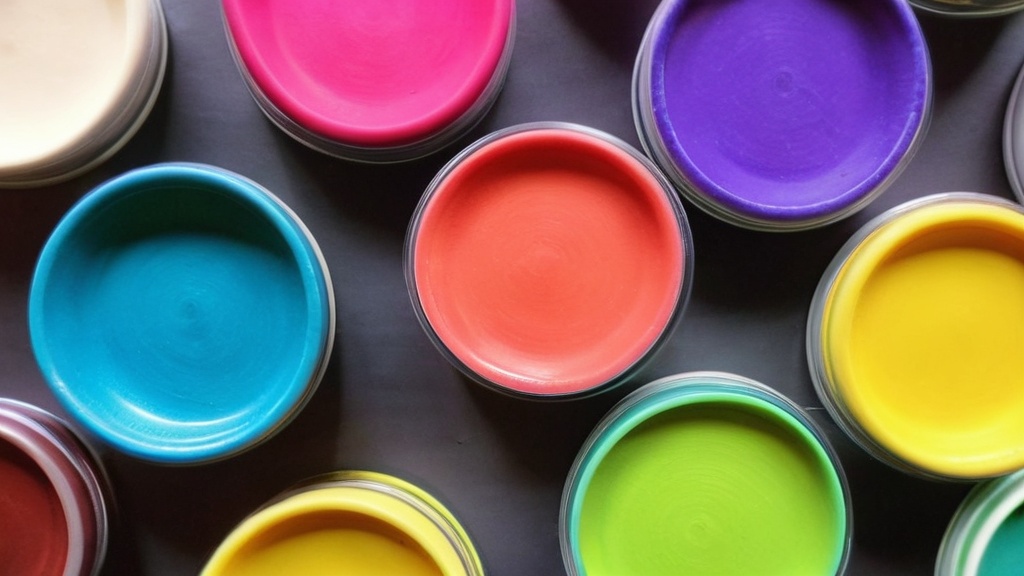
You’ve admired those stunning gradient earrings, the perfectly blended floral canes, and the intricate marble effects in other artists’ work. You’ve probably even felt a pang of envy, thinking, “How do they do that?” The secret, you’ve discovered, lies in mastering polymer clay color mixing. It’s not just about grabbing a few colors and mushing them together; it’s a nuanced art form that, with the right techniques and a little practice, you can absolutely conquer. This guide is your roadmap to unlocking the magic of perfect polymer clay blends, transforming your creations from good to absolutely breathtaking.
Before you even think about combining colors, you need to lay the groundwork. Just like a painter prepares their canvas and mixes their paints, you need to prepare your clay. This initial step is crucial for ensuring your mixing process is smooth, your colors are true, and your final results are consistent. Skipping this phase can lead to frustration, uneven blends, and colors that simply aren’t what you envisioned.
The Importance of Conditioning Your Clay
You might be tempted to grab your clay straight from the package and dive into mixing. However, unconditioned clay can be stiff, crumbly, and difficult to work with. This resistance makes it harder to achieve smooth, even blends. Think of it like trying to knead dough that’s straight out of the fridge – it’s tough and doesn’t incorporate ingredients well. Conditioning your clay first makes it pliable, flexible, and ready to accept and combine with other colors seamlessly.
How to Condition Effectively
Conditioning isn’t just about squishing the clay around. It’s about working the clay until it’s soft and supple. You can do this by hand, gently but firmly kneading, stretching, and folding the clay. You’ll feel it change texture from firm and a bit brittle to soft and smooth. A pasta machine is an absolute game-changer for conditioning. Run the clay through the widest setting multiple times, folding it in half between each pass. You’ll see it transform into a silky smooth sheet. This process not only softens the clay but also homogenizes its texture, which is vital for even color distribution.
The Golden Rule: Equal Thickness and Portions
When you’re mixing two or more colors, consistency is key. If you’re trying to create a gradient or a marbled effect, the proportions of each color matter immensely. Using equal thicknesses of each color you intend to mix is the simplest and most effective way to ensure that your starting points are balanced. This applies whether you’re cutting strips for a Skinner blend or portions for a marbling technique.
Why Proportions Matter
Imagine trying to mix a color where one component is a tiny speck and the other is a huge lump. It will take an enormous amount of effort to get the tiny speck to evenly distribute, and even then, the final color will be overwhelmingly dominated by the larger portion. By starting with equal thickness or roughly equal weights (depending on your method), you’re setting yourself up for a much more predictable and manageable mixing process. This also helps when you’re documenting your recipes, as you can refer back to a consistent ratio.
The Art of the Blend: Techniques for Seamless Transitions
Once your clay is conditioned and your portions are ready, it’s time to get your hands dirty and start blending. This is where the magic truly happens, and where your understanding of the mixing process will elevate your results. The techniques you employ here will directly impact the smoothness and beauty of your final colors.
The Power of Small Increments
One of the most common mistakes beginners make is adding too much of one color to another at once. You’re aiming for a specific shade, and you think a big dollop of white will lighten your dark blue quickly. Instead, you end up with a light blue that’s too light, and now you have to play catch-up with more dark blue, risking an overmixed, muddy result. The solution? Mix in small increments.
Mastering Incremental Mixing
Think of it like adding salt to a dish while cooking. You start with a little, taste, and then add more if needed. For polymer clay, this means taking a small sliver of your lightening or darkening color and incorporating it into the main mass. Work it in thoroughly until the color is completely uniform, then assess. If it’s still not quite right, add another small increment. This controlled approach allows you to meticulously fine-tune your shade, ensuring you land precisely on your desired hue without overshooting it. This is particularly important when working with vibrant pigments that can quickly overpower the mix.
The Pasta Machine’s Role in Perfect Blends
While hand-mixing can achieve some results, the pasta machine is your secret weapon for achieving incredibly smooth and even blends. It’s not just for conditioning; it’s an essential tool for the mixing process itself. The action of rolling and folding the clay repeatedly through the pasta machine ensures that the colors are thoroughly integrated and the transition is seamless.
Rolling and Folding for Uniformity
For techniques like Skinner blends, where you’re creating a gradient of two colors, the pasta machine is indispensable. You’ll roll out sheets of your two chosen colors, stack them, and run them through the machine. Then, you’ll fold the stack in half and repeat. Each pass stretches and merges the colors further. The key is to be consistent with your folding and rolling. You’ll observe the colors slowly, beautifully blending into each other, creating that coveted smooth transition. This technique is also excellent for creating marbled effects, as the streaks of color get pulled and blended into a beautiful, organic pattern.
Strategic Color Choices: Beyond Simple Mixing
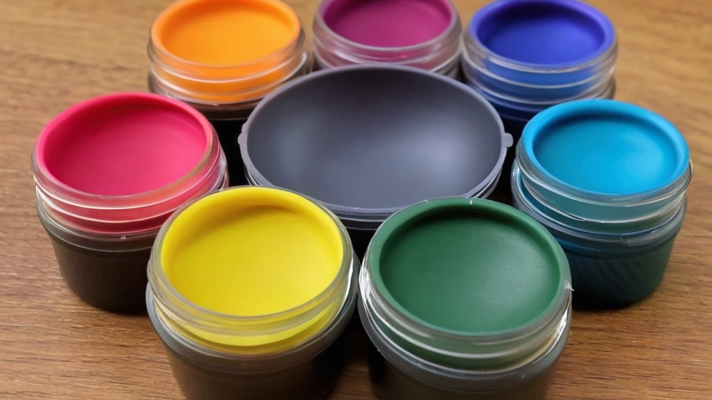
Simply throwing colors together isn’t always the path to your desired outcome. Understanding color theory, even at a basic level, can dramatically improve your color mixing results. There are specific strategies you can employ to achieve muted tones, earthy palettes, and vibrant, yet controlled, hues.
Lightening and Darkening with Purpose
You know that to make a color lighter, you add white, and to make it darker, you add black. This is a fundamental principle of color mixing. However, there’s a nuance to it, especially with polymer clay.
The Nuances of White and Black
White is generally a forgiving color to add. It will lighten your base color without significantly altering its hue. However, always add it in small increments to avoid making your color too pale. Black, on the other hand, is a powerful pigment. It can quickly and dramatically darken your mix, but it can also mute or muddy your colors if added too enthusiastically. Use black sparingly. A tiny speck can make a big difference. If you’re aiming for a deep, rich shade, start with a very small amount of black and gradually incorporate more, observing the change carefully. Sometimes, instead of black, a dark brown or a deep indigo can achieve a darkening effect without as much risk of muting.
The Magic of Complementary Colors
This is where color theory really shines. Complementary colors are colors that are directly opposite each other on the color wheel (e.g., blue and orange, red and green, yellow and violet). When you mix complementary colors, they don’t create a vibrant new shade; instead, they neutralize each other, resulting in muted, desaturated tones.
Muting and Creating Earthy Tones
If you find your colors are too bright, too garish, or just not right, try adding a tiny amount of their complementary color. For instance, if your green is too vibrant, a touch of red can bring it down to a more natural, earthy shade. If your purple is a little too electric, a hint of yellow will ground it. This technique is invaluable for creating sophisticated palettes that mimic natural elements – think mossy greens, dusty roses, and ochre browns. It’s the secret to achieving those complex, nuanced colors that have depth and character. Remember to add these complementary colors in very small amounts; you’re aiming to mute, not to create a muddy brown.
Testing and Documentation: Your Path to Predictability
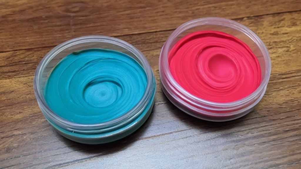
You’ve spent time carefully mixing, you’ve achieved a beautiful shade, and you’re ready to create a large batch. But hold on a moment! Before you commit your entire block of clay to this new color, there’s a crucial step that will save you future heartache: testing. And once you’ve found a winner, you’ll want to be able to recreate it.
The Indispensable Test Swatch
It might seem like an extra step, but creating test swatches is non-negotiable for successful polymer clay color mixing. The colors you see in their raw, unbaked state can and often will change after curing. Some colors might darken slightly, while others might shift in hue.
Why Swatches are Essential
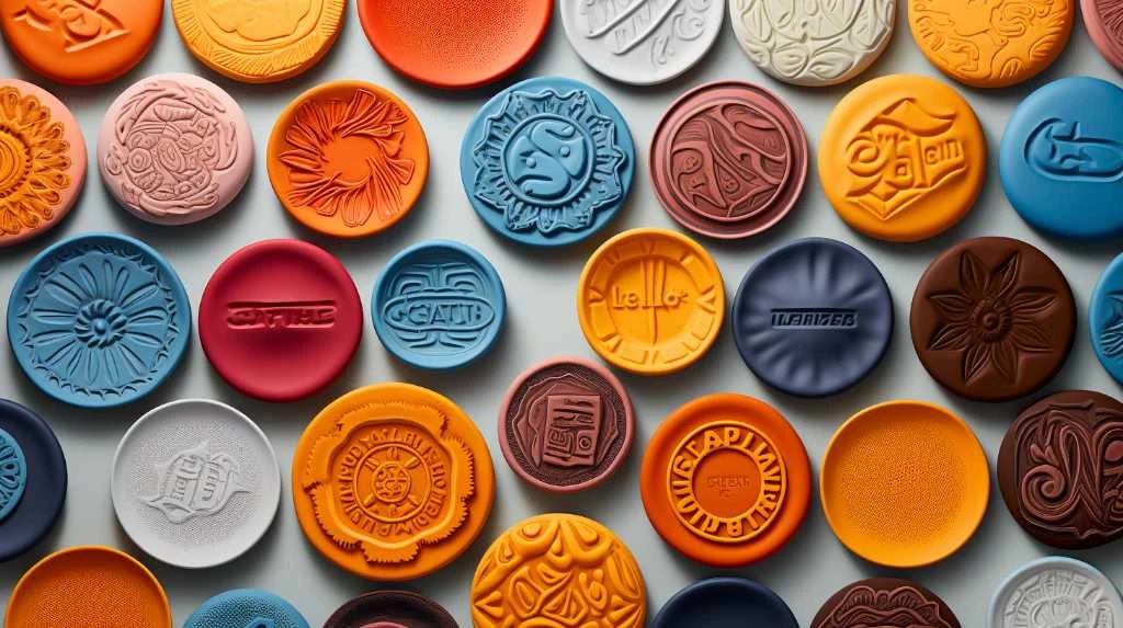
By mixing a small amount of your desired color, forming it into a small disc or square (a swatch), and baking it according to the clay manufacturer’s instructions, you get an accurate representation of the final color. This allows you to compare your swatch to your intended palette and make any necessary adjustments before you’ve used up a large quantity of clay. It’s like a dress rehearsal for your colors. If the baked swatch isn’t quite what you envisioned, you can go back to your mixing process with this valuable feedback.
The Power of a Color Recipe System
Once you’ve discovered a perfect blend, you’ll want to be able to replicate it. Whether it’s for a recurring project, a consistent color scheme for your brand, or simply because you loved it so much you want to use it again, a color recipe system is your best friend.
Documenting for Reproducibility
This system can be as simple or as elaborate as you like, but the core idea is to record the exact proportions of each color you used to achieve a specific shade. You can use a dedicated notebook, a spreadsheet, or even digital notes. For each custom color, record:
- The Base Colors: List the brands and specific colors you started with (e.g., Premo! Cobalt Blue, Sculpey Soufflé Mandarin).
- The Ratios/Measurements: This is the most critical part. If you’re measuring by weight, specify grams or ounces. If you’re cutting strips for a Skinner blend, note the dimensions or the number of strips. If you’re using approximate visual portions, describe them as clearly as possible (e.g., “1 part white to 4 parts turquoise”).
- The Accent Colors: Note any complementary colors or accent colors used for muting or special effects.
- A Swatch: Glue a small baked swatch of the custom color next to your notes.
- Notes: Add any observations, such as how much black was used, or if the color darkened more than expected.
This diligent documentation will save you countless hours of trial and error in the future and ensure you can always recreate those signature shades that make your work unique.
Advanced Techniques for Expressive Palettes
| Color Mixing Tip | Description |
|---|---|
| Start with primary colors | Begin by mixing primary colors (red, blue, yellow) to create a wide range of secondary and tertiary colors. |
| Use small amounts | When mixing colors, start with small amounts of clay to avoid wasting materials and to have better control over the color outcome. |
| Blend thoroughly | Ensure that the colors are thoroughly blended together to avoid streaks or uneven color distribution in the clay. |
| Keep track of proportions | Take note of the proportions of each color used in the mixing process to replicate the same color in the future. |
| Experiment and test | Don’t be afraid to experiment with different color combinations and test the results before committing to a larger project. |
Once you’ve got the basics down, you’re ready to explore some more advanced techniques that can add a special spark to your color mixes. These methods, while requiring a bit more finesse, can elevate your work from beautiful to truly captivating.
The “Color Plus 1” Trick
This is a clever and simple technique that can add depth, cohesion, and an unexpected flair to your color palettes. The “Color Plus 1” trick involves adding a small, carefully chosen accent color to your primary mix. This accent color isn’t meant to dramatically change the overall hue, but rather to subtly influence it.
Building Cohesion and Iridescence
What kind of accent colors work best? Think metallic golds, silvers, or bronzes. A touch of black can add depth without necessarily darkening the color significantly. Even a tiny amount of a contrasting or harmonious color can create interesting effects. For example, adding a tiny speck of iridescent gold to a deep teal can give it a subtle shimmer and complexity. Adding a minuscule amount of deep indigo to a rich purple can make it appear more velvety. The “Plus 1” can also be used to build cohesive palettes. If you’re working with a set of colors, introducing a tiny amount of a unifying accent color across all of them can make them feel like they belong together, even if their base hues are quite different. Experiment with this “Color Plus 1” concept to discover how small additions can lead to big visual impacts, creating subtle iridescence and a more sophisticated overall aesthetic.
Considering the Influence of Other Additives
Beyond basic color pigments, polymer clay often contains other elements that can affect your mixing. Understanding these interactions will further refine your results.
Metallic, Pearl, and Translucent Effects
When you mix colors with metallic or pearl finishes, the mica particles within the clay will distribute throughout your blend. This can create a beautiful shimmer that runs through the entire mix. However, be mindful that these additives can sometimes mute the base color slightly. Translucent clays are also excellent for mixing. When you mix a translucent clay with an opaque color, you’ll achieve a stained-glass effect, where the color appears richer and has a beautiful depth. The amount of translucent clay you use will determine how transparent or opaque your final color becomes. Mixing translucent clay with opaque colors is a fantastic way to create luminous effects and gemstone-like qualities in your work.
By embracing these tips and techniques, you’re well on your way to mastering polymer clay color mixing. Remember that patience, practice, and a willingness to experiment are your greatest allies. So, dive in, play with your colors, and create the stunning, vibrant, and nuanced palettes you’ve always dreamed of!
FAQs
What is polymer clay color mixing?
Polymer clay color mixing is the process of combining different colors of polymer clay to create new custom colors. This can be done by blending two or more colors together to achieve the desired shade.
What are some tips for successful polymer clay color mixing?
Some tips for successful polymer clay color mixing include starting with small amounts of clay, using a clean work surface and tools, and blending the colors thoroughly to avoid streaks or uneven color distribution.
Can I mix different brands of polymer clay together?
Yes, different brands of polymer clay can be mixed together to create custom colors. However, it’s important to note that different brands may have slightly different properties, so it’s best to test the compatibility of the clays before mixing large quantities.
What tools can I use for polymer clay color mixing?
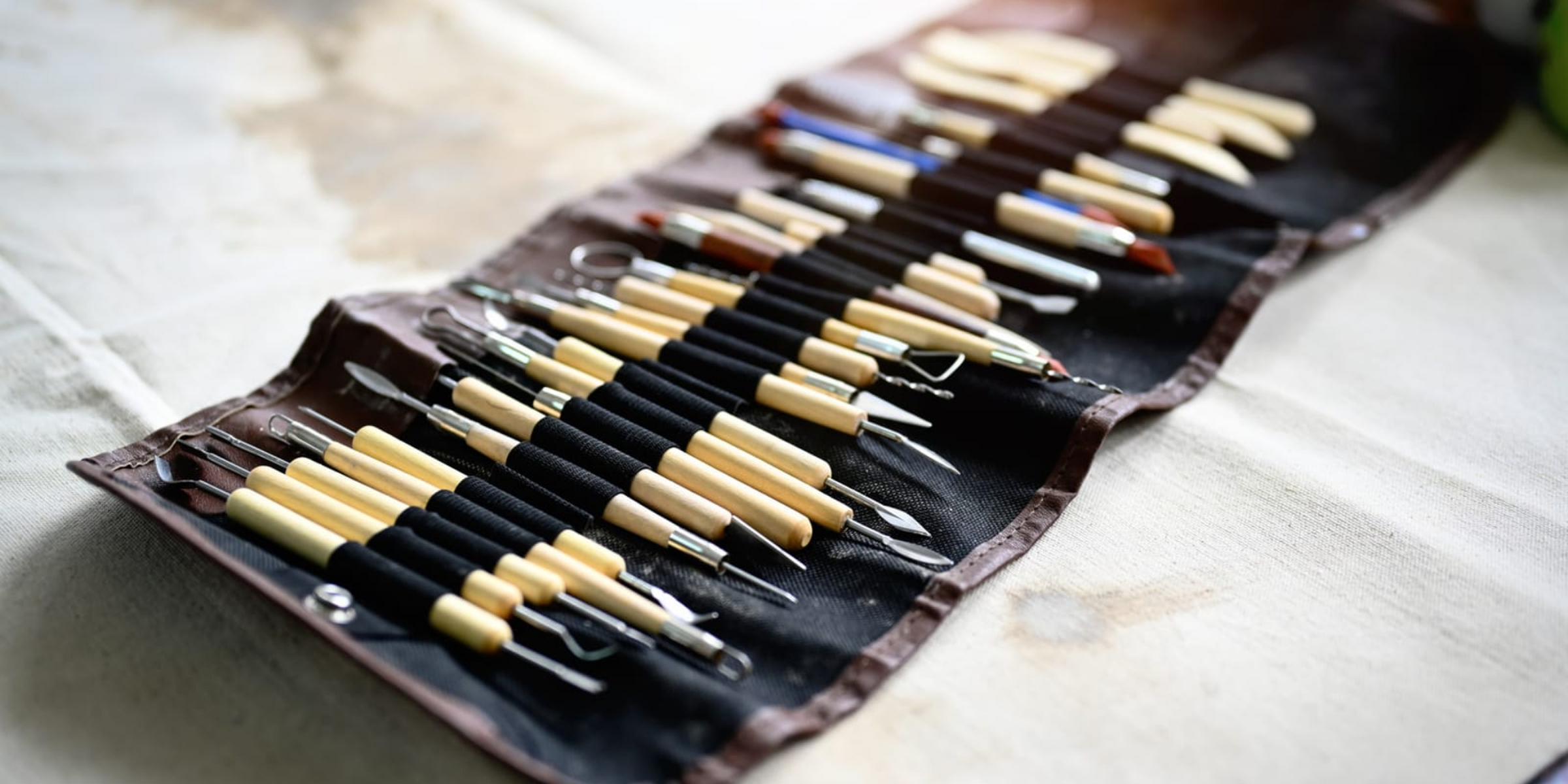
Tools for polymer clay color mixing can include a pasta machine for blending large amounts of clay, as well as a clay blade, acrylic roller, and various sculpting tools for more detailed blending and shaping.
Are there any special techniques for achieving specific color effects with polymer clay?
Yes, there are special techniques for achieving specific color effects with polymer clay, such as marbling, gradient blending, and creating custom color palettes using a color wheel as a guide. These techniques can help artists achieve unique and intricate color combinations in their polymer clay creations.